Saturday, June 05, 2004

Mandala 6 with some color


Mandala 6 after a little Photoshop play. Posted by Hello

Mandala 6 -- Dry Brush


Here is a variation on Mandala 6 again experimenting with the wonders of Photoshop. I believe I applied a water paper filter, first and then a dry brush filter. I like the batik-like look of the result. Posted by Hello

Mandala 6


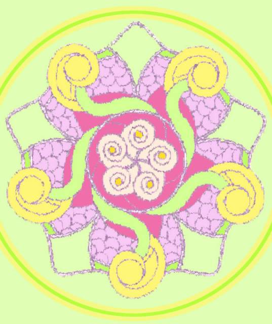
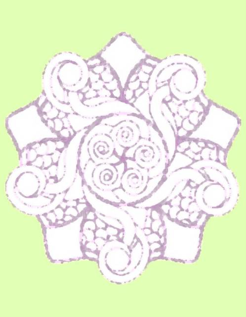
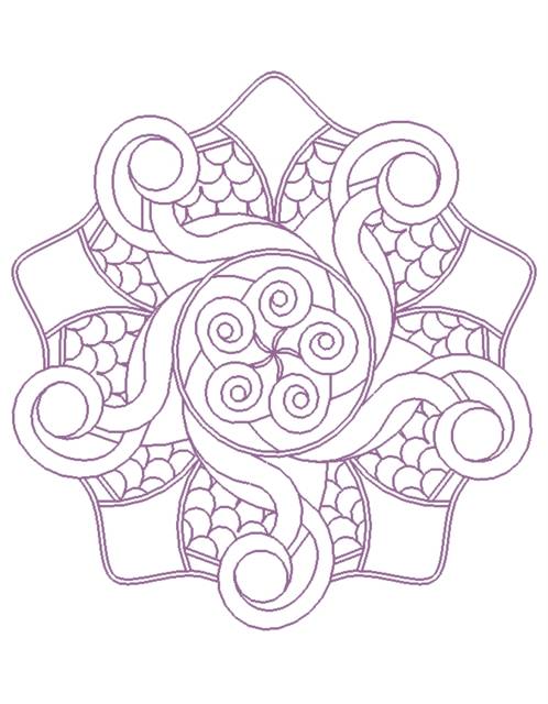
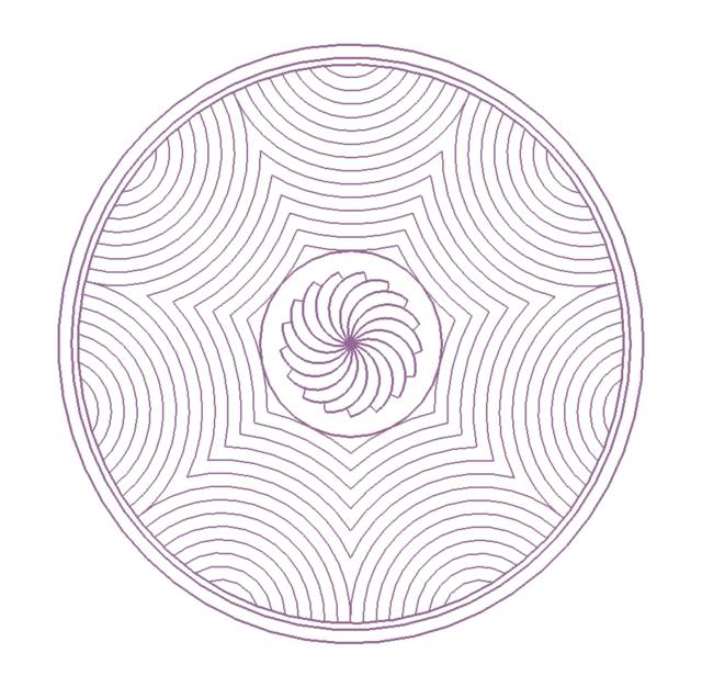
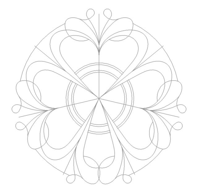
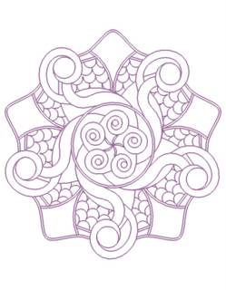
I believe this is the first five-armed mandala that I have posted on this blog.

I struggled with this one, initially using only arcs, trying to achieve a design that had some "flow" to it. I finally resorted to some splines to get the shapes that I wanted. The "bell-shaped" curves on the perimeter of the mandala are splines. Also, if you look at the "rose" shapes in the center, they aren't perfectly circular. I purposefully put some "flats" in them for interest. The flats are achieved by having two arcs come in non-tangent to one another; that is, not at 0 or 180 degrees, but something close to that.

Overall, I struggled with this one and I think the result reflects that. Ah well, better luck next time. Posted by Hello

Friday, June 04, 2004

Mandala 5


Here's another design based on the number seven. I particularly like the flower-like petal design in the middle. As I worked, it evolved and emerged. What a nice surprise! Posted by Hello

Mandala 4


This is a seven-spoked mandala. When I first started this, I found myself wanting to create symmetry, even with an odd number of axes. While each spoke may look identical, they are not. Look carefully. Posted by Hello

Boots


Here is an image I found via Google Images and then modified in Photoshop.

I love how worn and gritty they look, after applying these particular filters.

 Posted by Hello

Monday, May 31, 2004

Mandala 3 -- The Circular Centipede


Have you ever seen a seventeen-footed circular centipede?

Well, if not, here's my approximation of one. Posted by Hello

Sunday, May 30, 2004

Hiroplum


This is "Hiroplum" from John Hudock's collection of Japanese prints (seen at Common Sense & Wonder).

I was immediately drawn to this print because of the gorgeous juxtaposition of green and red. While many of us may associate those colors with Christmas, this Japanese artist probably felt and saw something quite different.

I also appreciated the little quarter-circle cutouts at the corners of this print. I tried to reinforce that small design motif in my horizontal background.